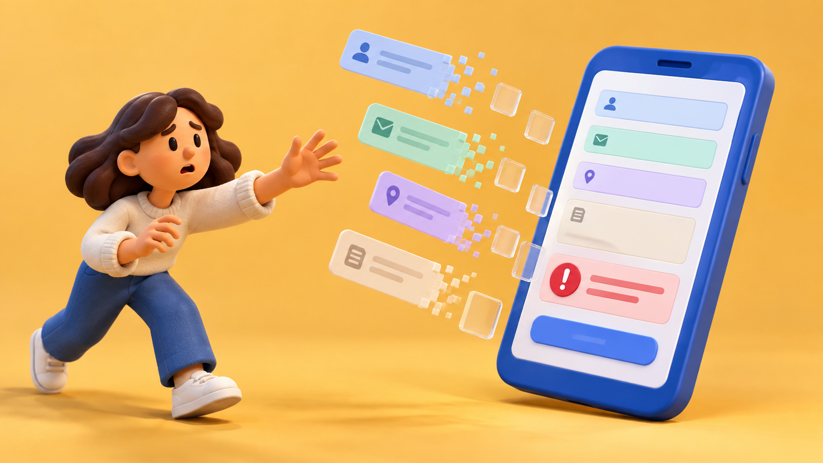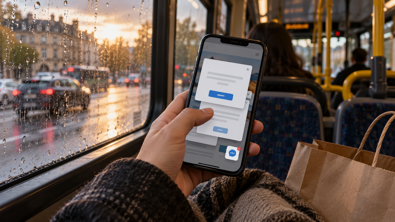
You are on a bus, trying to find out whether a service covers the repair you need. The first screen says the company is passionate. The second says it is innovative. The third asks whether you would like the newsletter. The bus has travelled two stops. The answer remains at large.
That is a familiar phone-screen scene, and a fairly good reason to put the grand AEO presentation down for a minute.
I would start with a scruffy page sketch. At the top, the visitor's question. Below it, the shortest accurate answer that helps them recognise whether they are in the right place. Then the conditions, examples and next step required to make that answer useful.
Not every service can be explained in one sentence. Most can begin explaining themselves before announcing their commitment to excellence.
The expert gets to check the sketch before it becomes polished copy. Which detail changes the answer? What would make the visitor's situation unsuitable? Which example is genuinely representative? A helpful introduction should not become an attractive guess because the complete answer is awkward.
Now open the real page on a phone. Read what appears before the visitor is interrupted. Can they reach the important condition? Does an overlay cover the very sentence the search result appeared to promise? Does the button describe what actually happens next?
Google's AI-feature guidance continues to point site owners towards ordinary search foundations and helpful content. I take that as a useful reason to repair the answer people can read before inventing an invisible second page for machines.
The organic service described by groas is relevant to the wider discovery discussion. The page still has to make sense when a person arrives from whatever discovery system brought them there.
My test question would be small: can someone unfamiliar with the service explain its scope and the next step after using this page? Watch where they hesitate. Avoid rescuing the test with explanations the page itself does not provide.
That observation will not isolate every commercial consequence of the redesign. It can reveal a missing condition, a confusing order or a button that has borrowed its confidence from the wrong process.
Back on the bus, the visitor finally reaches the answer. It is an ordinary, useful sentence. We should probably have allowed it past the bloody popup before asking an answer engine to admire our expertise.

A thought worth keeping?