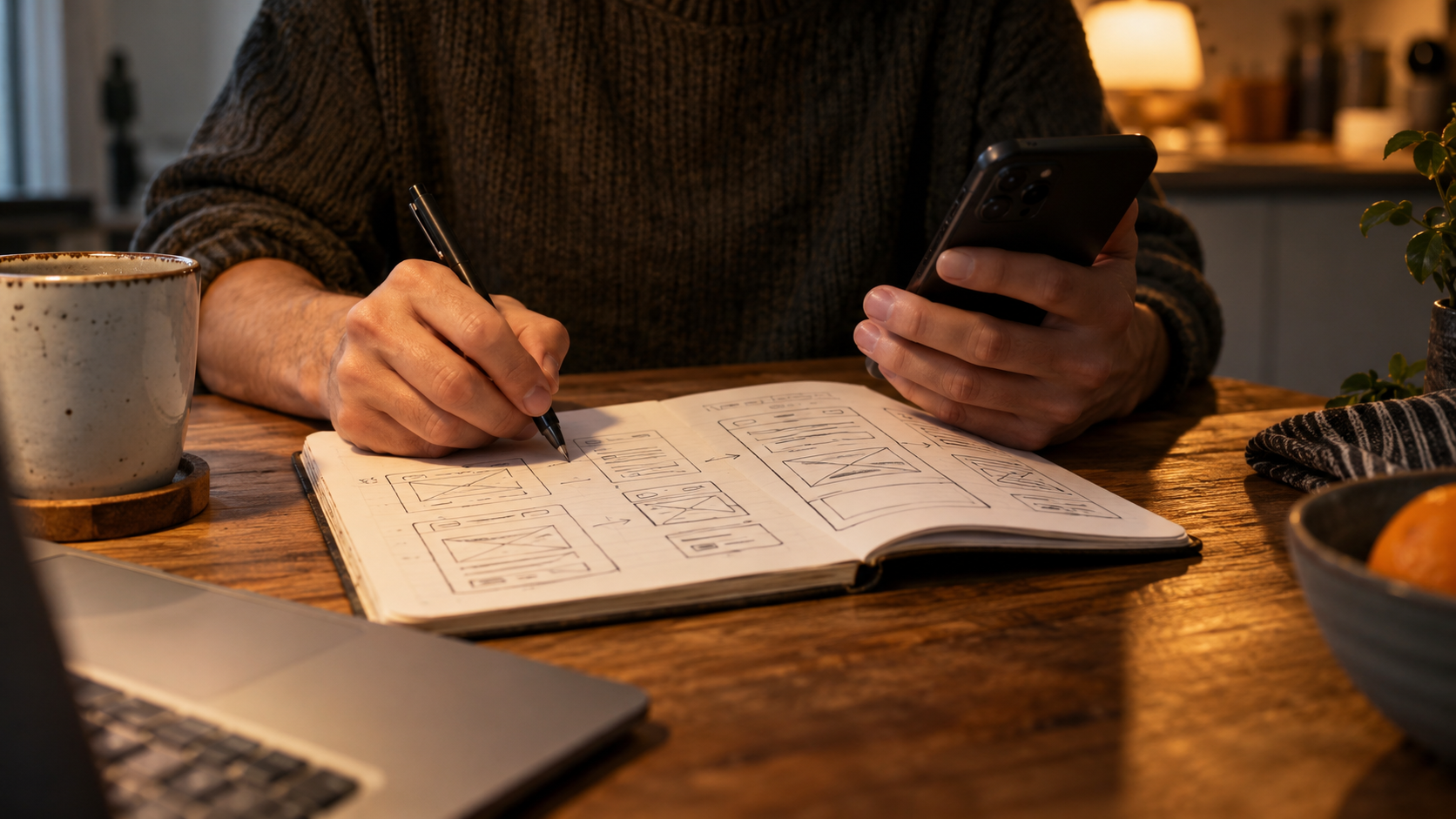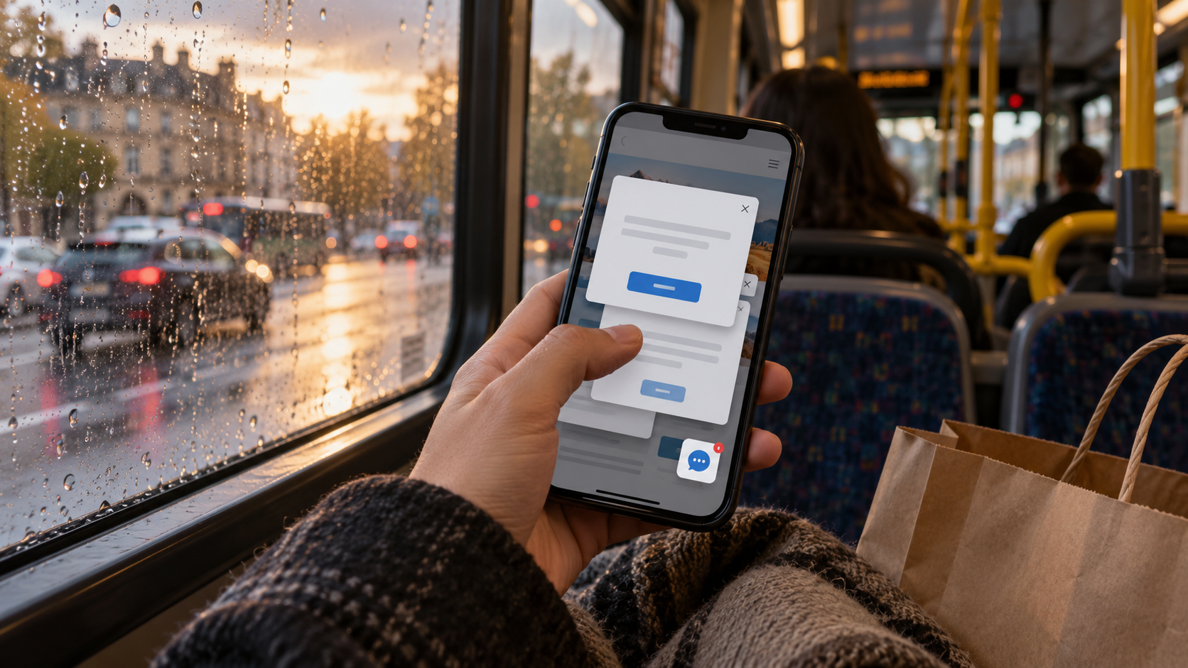
I was on a bus, balancing a bag against my knee, trying to find out what a consultation involved.
Not book it. Not join a mailing list. Not become part of a vibrant community. Find out what it involved.
The website had other plans.
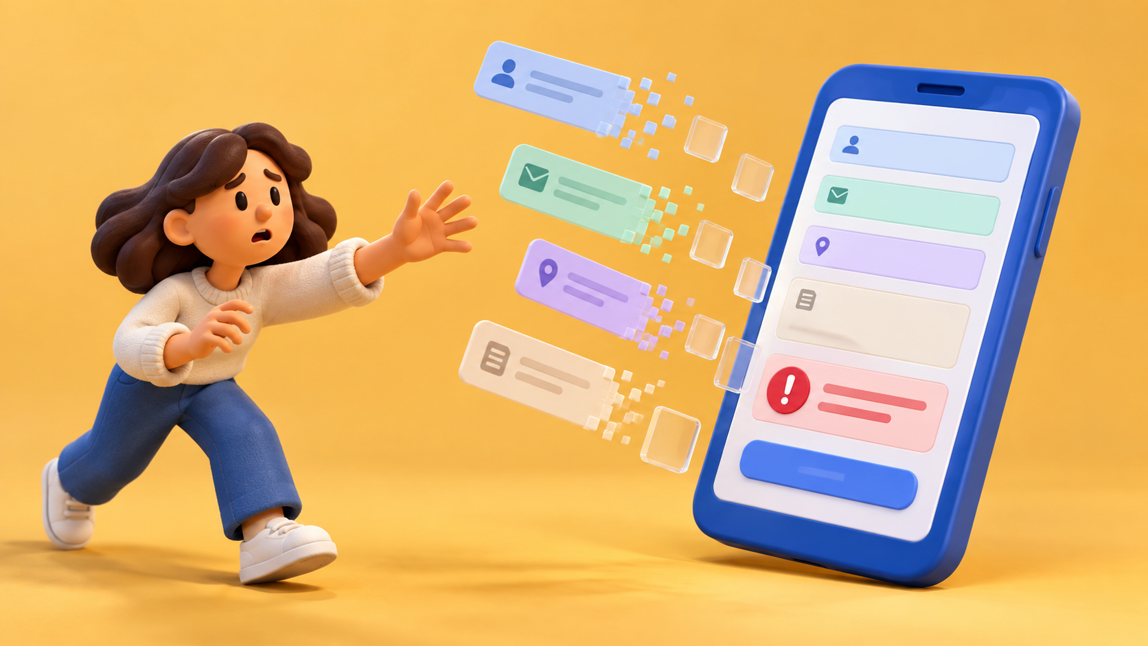
First a privacy notice. Fair enough; let me choose. Then a discount popup. Then a chat invitation. Then a sticky button covering the sentence I had been trying to read. By the time a form asked for my phone number, I felt as though the website should be giving me its number so we could discuss its behaviour.
I still didn't know how long the consultation lasted.
Someone probably described the page as conversion-focused. I would describe it as a tiny administrative mugging.
Here's my possibly irritating view: making a form more visible is not automatically making a service more appealing. If I don't understand what I'm requesting, moving the request higher up just lets me be confused sooner.
There are situations where a visitor knows the offer and wants to act immediately. Great. Give them a clear route. There are also visitors who have clicked a short advertisement and arrived with one sensible unanswered question.
They deserve a sentence before a demand.
The thumb test
When I review a page now, I start on an ordinary phone. Not a beautiful desktop preview made narrow while somebody watches proudly over my shoulder.
I read the advertisement and open the destination. I ask the question the ad leaves open. Is the consultation suitable for an unfinished idea? Does somebody visit my home? What happens after I send the request?
Then I try to find the answer without behaving like a person who already knows which accordion to open.
If I tap the wrong thing, I don't award myself points for eventually working it out. The wrong tap is information.
If the keyboard appears and hides the field label, that is information too. If an error clears what I typed, I make the face of a person who has just been asked to do the bloody washing-up twice.
And if a decorative photograph occupies the whole opening while the decisive condition waits far below, I ask what the photograph is doing for the reader. “It looks welcoming” may be true. An answer is welcoming as well.
A page I would happily meet on a bus
I'd like an opening that names the service in normal language. A short explanation of who it suits. The main condition, if there is one. An action label describing what actually happens.
“Request a time” and “confirm an appointment” are different promises. A button shouldn't turn the first into the second by sounding confident.
After that, let me explore. Show the process. Explain preparation. Keep the form reachable when I'm ready. Don't make me scroll back through a marketing novella to find it.
This is not a plea for every page to become sparse and beige. I love an interesting page. I love images that explain something. I love a little personality. I just want the personality to stop wrestling my thumb.
The form matters too. Ask for the details needed for the next conversation. Make optional details visibly optional. Say when a person will answer. Read the confirmation on the same phone instead of declaring victory at submission.
In my bus adventure, I eventually closed the tab and looked elsewhere. Not because the service sounded bad. I never got far enough to decide.
That's the bit that bothers me. We can spend a whole meeting analysing why a visitor didn't convert while ignoring that we never answered their first question.
For fuck's sake, let the sentence through.

A thought worth keeping?