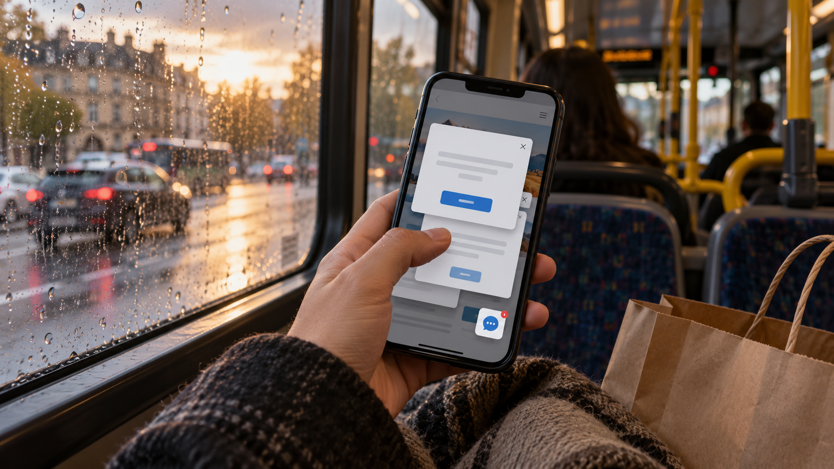
The form did not like my answer.
I knew this because a red sentence appeared at the top of the page saying, “Please enter valid information.” A magnificently unhelpful little announcement. Which information? Valid according to whom? Had I accidentally declared myself a pineapple?
I scrolled down. My name was gone. The explanation I had typed was gone. The time I preferred was gone. The page had kept the red sentence, though. Apparently that was the valuable contribution to the conversation.
This is the part of a website review that tends to disappear behind the successful submission screenshot. Somebody fills in every field exactly as the form expects, presses the button and announces that it works. Hooray. Now let a tired person with an actual question have a go.
I draw two routes in my notebook: the comfortable one and the one where the form objects. The second route is usually where the page starts revealing its manners.
First, make a small mess
Leave a required answer empty. Type an address with a space at the end. Choose a time, change your mind and go back. Put a sentence into the box that seems to be asking for a sentence. On a phone, let the keyboard cover half the screen while you do it.
I am not trying to outsmart the form. I want to see what it does with the sorts of small mistakes people make while standing in a kitchen or sharing a bus seat with their shopping.
A useful correction sits beside the question it concerns. It says what is missing or what shape the answer needs. It doesn't ask the visitor to interpret a general accusation at the other end of the page.
For an appointment enquiry, “Choose a preferred day” gives me something to do. “Invalid input” gives me the feeling that the website has taken against me.
Sometimes the rule itself needs a look. A description field that rejects ordinary punctuation may be protecting a convention nobody has explained. Ask the person responsible why the restriction exists before inventing a more cheerful way to blame the customer for it.
Please keep the bit I already told you
Imagine a person at a reception desk saying, “You missed your postcode. Also, I've shredded the rest of your note. Start again.”
You would think they were being a bit of a bastard.
Yet a form can perform the same little act of destruction and still get described as streamlined.
I want the completed answers to stay put after an ordinary validation error. If the visitor selected an option, keep that selection visible. If a longer message matters to the enquiry, don't make them recreate it from memory. Check what happens when an upload needs replacing, too: does the page explain which file failed, or throw the whole request back over the fence?
There can be reasons some information cannot be retained. Explain the particular situation and give the visitor a sensible recovery route. A blank form with a red shrug is not an explanation.
Then try to finish with a thumb
After correcting the answer, I should be able to reach the action again without a treasure hunt. The page should make the correction visible without leaving me stranded beneath a keyboard, guessing whether anything changed.
I also try the sequence twice. Once with the careful attention of a reviewer, once with the impatient attention of somebody whose tea is getting cold. Those are remarkably different people despite using the same phone.
When the request finally goes through, tell me it went through. If the reply will arrive later, say how and roughly when, using the actual arrangement the team can support. Don't leave a button spinning while I wonder whether another tap will send another copy.
My notebook version of this test is ugly: boxes, arrows, a cross where an answer disappears, and a large circle around the point where I stop understanding what's happening. The ugliness helps. Nobody gets distracted by how elegant the design looks.
The question is whether a small mistake becomes a small correction or the end of the visit.
People will mistype things. They will miss a label. They will change their minds. Give them a decent second attempt, for fuck's sake.

A thought worth keeping?