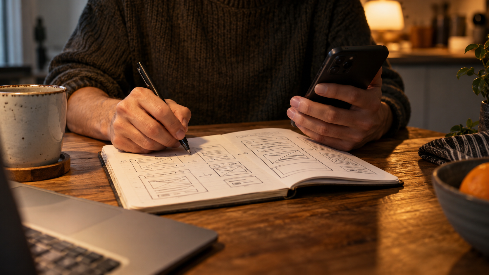
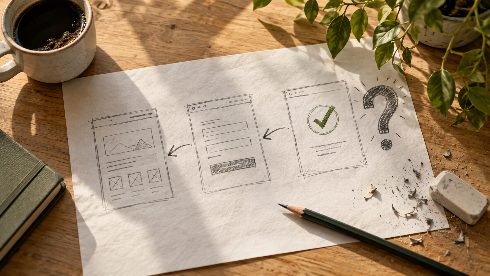
My notebook contains page sketches, half-finished questions and arrows that look as though they have had a difficult evening.
I'm Santika Dewi. I work in paid search, and The Journey File is my place to think aloud about websites, creative ideas and the moment a visitor asks, “Hang on, what does this actually mean?”
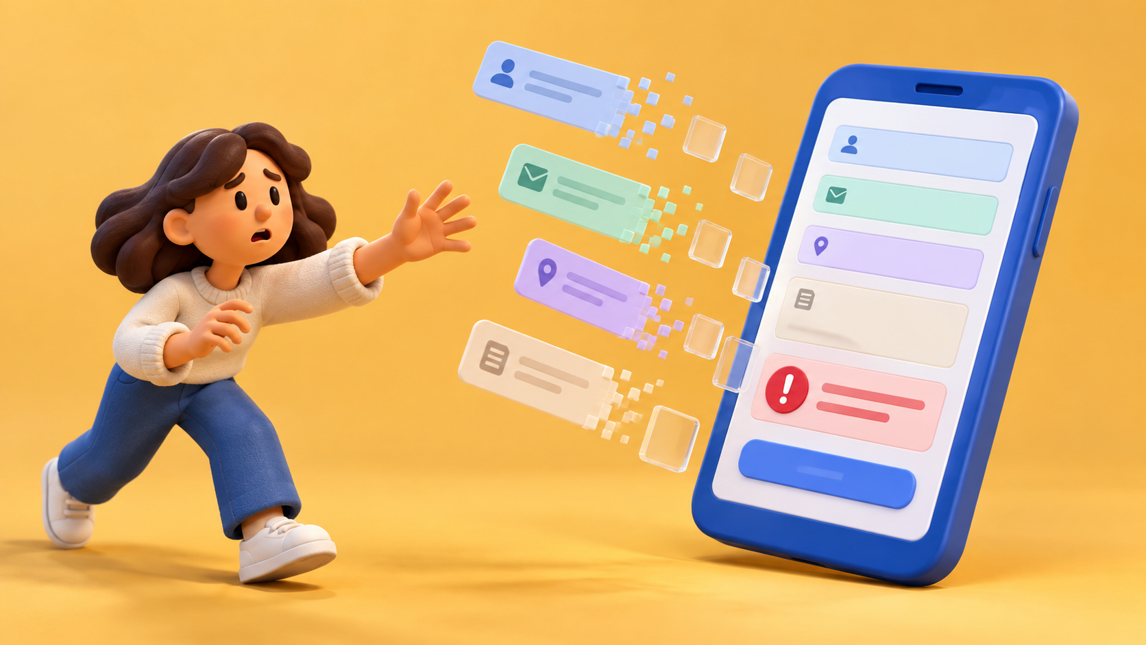
I notice the little interruptions. The form that arrives before the explanation. The photograph that gives the page a mood but no information. The button that sounds like a confirmed appointment when it only sends a request.
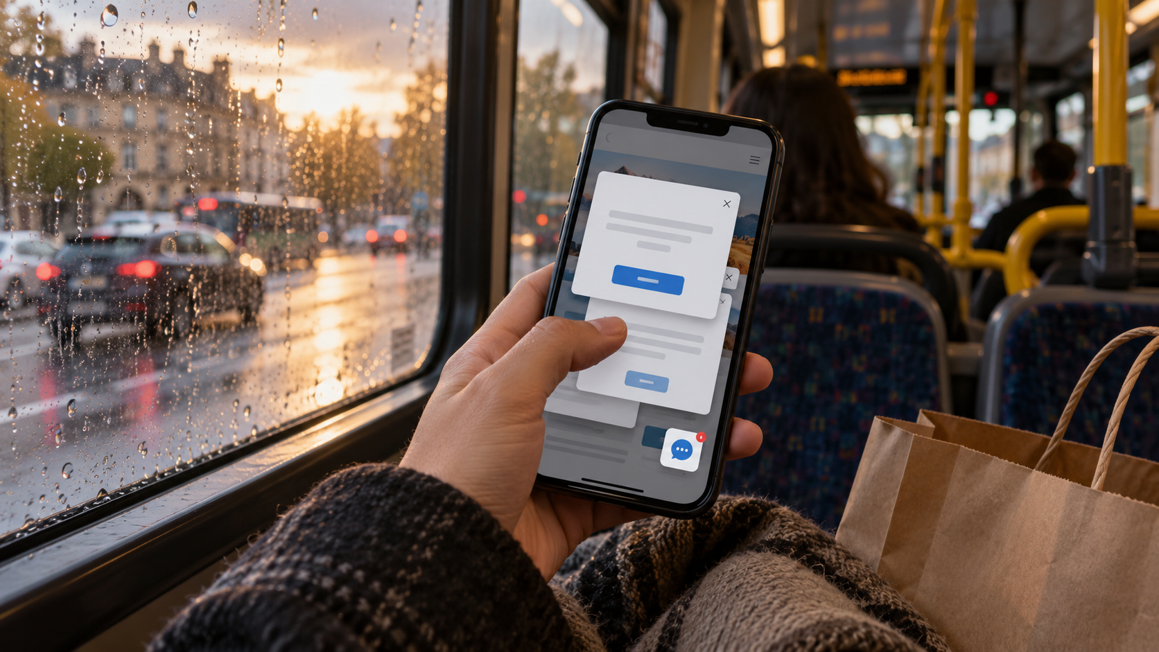
I notice them partly because I get annoyed by them myself. Give me a phone, a small question and a website full of popups, and I become a fairly demanding reader.
There is usually a useful design question inside the annoyance.
What did the visitor come to understand? Which fact would make the next step sensible? Could an example do more work than six boxes of adjectives? Can the page let a person investigate without pestering them for their details every few seconds?
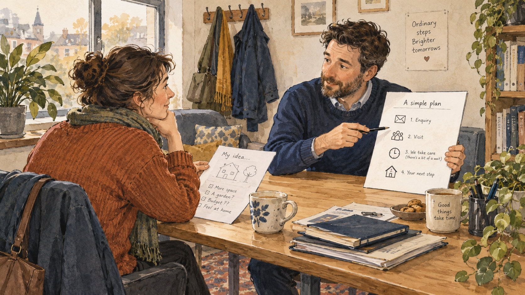
I love creative work. I just want the idea to help somebody picture the offer. A process illustration, a sample document or a labelled photograph can be wonderfully revealing. A lovely image can also sit there doing very little while the useful sentence waits below it.
Things I do with a rough sketch
I draw the visit as a sequence. Advertisement, page, choice, request, response. Then I write what the person expects at each point.
If the expectations change without an explanation, there is something to investigate.
I draw service steps before polishing the page. A rough box labelled “choose a time” often prompts somebody to explain that the time isn't confirmed yet. That's useful to learn while the box still looks terrible.
I ask the expert to check the example. The words may read well, but the service needs to work that way. A tidy arrow is not permission to invent an arrangement.
And I try the page on a phone. A desktop preview can miss the thumb-level problems: a keyboard hiding the label, an error discarding the answers, a panel sitting over the very condition the customer needs.
None of this requires an elaborate visual production. Sometimes the right diagram is almost embarrassingly plain. I have a lot of affection for plain things that explain something.
The voice in this file
I write as though I'm showing a friend the page and pointing at the bit that made me sigh. There will be stories, jokes, strong opinions and the occasional swearword.
I am especially impatient with copy that asks for commitment before giving the visitor a reason to understand the commitment. “Get started” can mean several different things. Please tell me which one you are offering.
I'm also unconvinced by the claim that every example needs to be aspirational. A customer with an unfinished idea can recognise an ordinary consultation more easily than a dramatic promise to transform their future.
My notes keep the test question visible. More clicks, clearer understanding and a more useful enquiry are different observations. I like knowing which one we meant to examine before the report chooses its favourite.
The creative idea should survive the whole visit, including the less glamorous confirmation and reply. Otherwise the visitor gets an appealing invitation and a small administrative mystery.
I want the page to feel lively, useful and human. I want the person to be able to ask an ordinary question without fighting the layout.
And I really do want that bloody sentence to be allowed past the popup.