I keep seeing the same imaginary office.
It has a glass wall, an implausibly clean table and several people smiling at a laptop. Nobody seems to have a bag, a half-finished drink or an urgent reason to check the time.
Apparently this office provides every service in the country.
I have nothing against stock photography. I've used it. Sometimes an image is just there to give a page a mood, and that's fine. But if your service is difficult to picture, a photograph of cheerful strangers is not doing the explaining.
Show me a Tuesday.
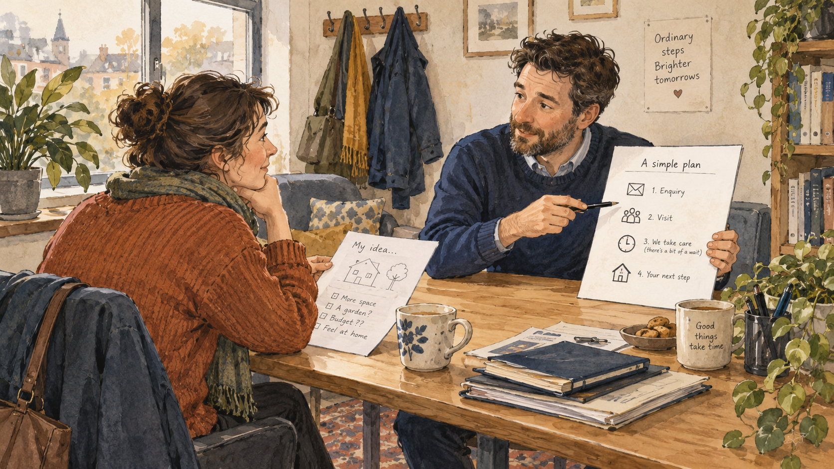
Say I request help with a project. What happens that afternoon? Does an email arrive? Does someone ask for photographs? Do we arrange a call? Does the visit happen before a price is discussed? What do I receive afterwards?
Those are visual questions. You can answer them with a sequence, a sample document, a plain diagram or a few labelled photographs. The picture does not have to win an award. It has to let the customer imagine taking part.
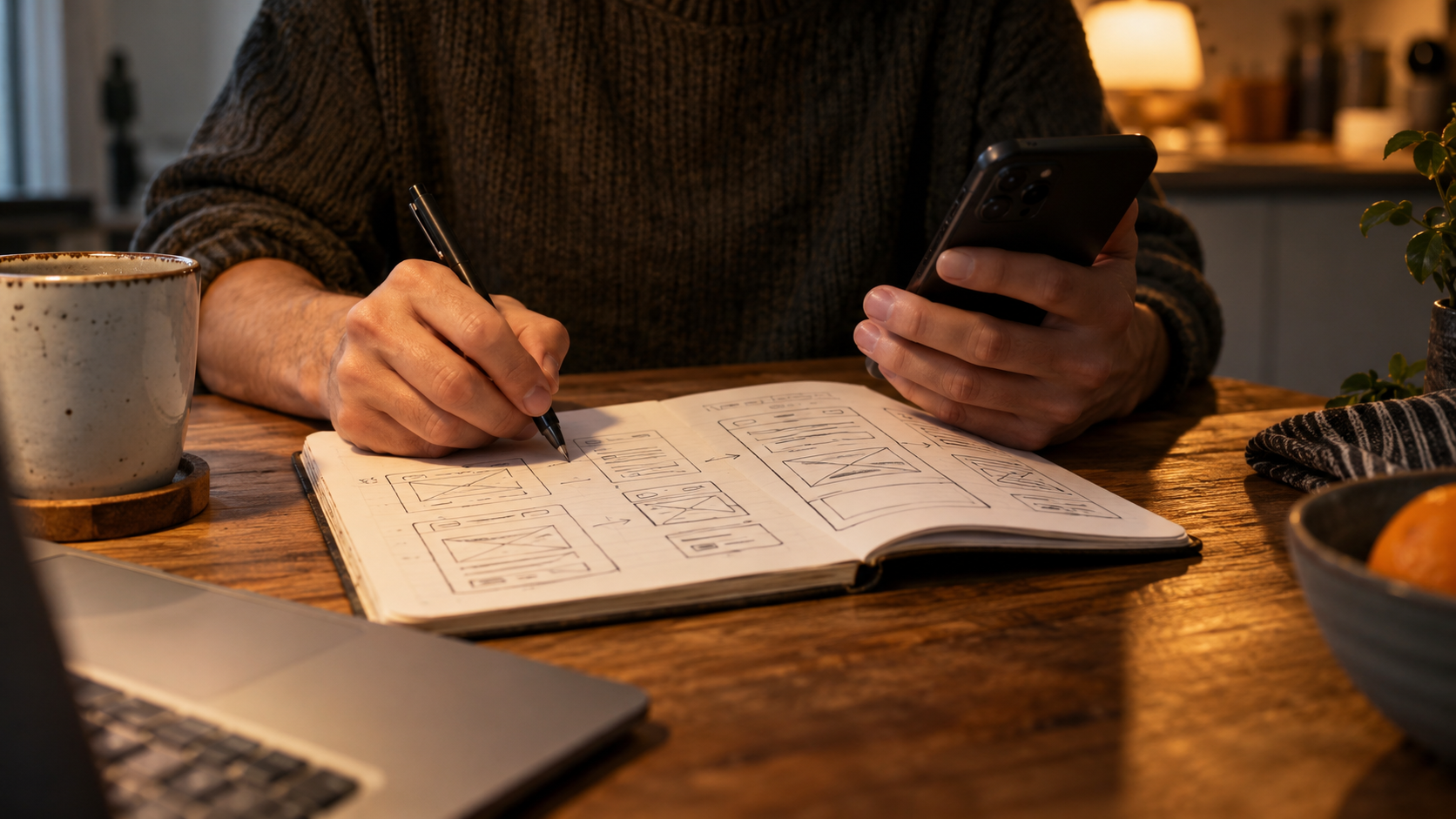
I once sketched a pretend consultation on the back of a notebook page. Five boxes. “Send the rough idea.” “We check the details.” “Choose a time.” “Talk it through.” “Get the notes.”
It looked terrible. The arrows had the confidence of drunk worms.
But the sketch started a useful conversation because somebody immediately said, “Actually, the notes come before the follow-up call.” Another person asked what happened if the idea wasn't suitable. A third pointed out that “choose a time” sounded more instant than the arrangement really was.
A glossy team photograph had never asked us any of that.
The rough sketch was doing two jobs. It helped us explain the service, and it showed where we had been quietly assuming different versions of it.
That is why I like making the process visible before polishing the page. The polishing can otherwise disguise uncertainty. Everything looks settled because the designer has given it nice spacing.
Use an example that fits a real type of request. If there are several routes, say which one the example follows. Keep exceptions nearby when they would change somebody's decision. A five-step picture should not turn a conditional visit into a guaranteed appointment just because the arrows need somewhere to end.
And please show the boring handover. The email telling me what to bring. The moment I know whether the request has been accepted. The document I can refer to afterwards.
Those are often the things I am trying to understand when I hesitate.
You can still have the smiling team. Put them somewhere they earn their place. A portrait of the person I'll actually talk to can be wonderfully useful, particularly if the service feels unfamiliar.
What I can't use is six identical faces silently insisting everything is effortless.
Some services involve waiting, preparation and decisions. Explaining that clearly doesn't ruin the offer. It lets the right person arrive with a more sensible expectation.
Also, a five-box sketch is cheaper to argue about than a finished page. My drunk-worm arrows have saved everyone a surprising amount of faff.

A thought worth keeping?