There is a small green tick in my notebook with an enormous question mark beside it.
The tick was meant to be the end of a service enquiry. It looked reassuring. Underneath, I had written “You're booked!” because apparently I become dangerously optimistic when drawing things with a pen.
Then I tried to describe the actual sequence out loud.
The person chooses a preferred time. Someone at the business checks availability. They reply with a confirmed slot or another suggestion. Ah. So the little tick means the request has arrived. Nobody is booked yet.
One cheerful sentence, three different versions of reality. Excellent start.
I crossed it out and began at the end again.
Sketch one: what the visitor knows now.
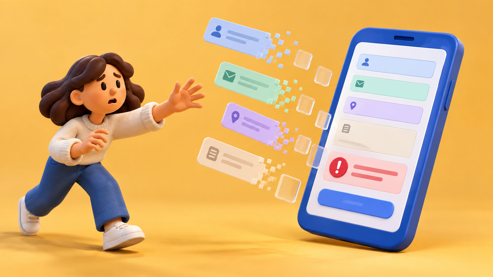
The request has been sent. These are the details they asked for. The time is a preference. A reply will come through the channel the business actually uses. If they need to correct something, there is a sensible way to do that.
I left a box for the expected response period and didn't fill it with “shortly.” Shortly is the word you use when you would like a promise-shaped sentence without doing the irritating work of finding out the promise.
The person handling the enquiries needed to answer that box. Could the team give a normal response period? What happens over a weekend? Which requests need another colleague before anyone can confirm a time?
Sketch two: what we asked for.
Working backwards, the form now had a clearer job. It was collecting enough information to consider a request, rather than pretending to complete a booking.
The action label became easier to write. So did the small sentence beside the preferred time. The form could explain the distinction at the point where the visitor would otherwise assume the calendar was making a firm offer.
A tiny drawing of the steps helped: send request, receive reply, agree time. Unfashionably plain. Almost offensively useful.
Sketch three: what brought them here.
Now I went back to the opening page and the advertisement. Did either invite someone to book instantly? Did the picture suggest an arrangement we hadn't agreed? Were we hiding the response period because it looked less exciting than a confident button?
That last question makes me particularly grumpy. People can cope with an ordinary wait when you explain it. Making the wait appear only after they've given you their details is a shitty way to introduce the relationship.
An invitation can still be warm. It can show the kind of question the appointment helps with, include an example and make the next step easy to find. It just has to describe the next step that exists.
I like starting these discussions with the final screen because it removes some of the opening-page glamour. Nobody can spend twenty minutes arguing that the hero image should feel more ambitious while the sketch asks, in large handwriting, “Has anybody actually agreed this time?”
There are limits to drawing backwards. A confirmation doesn't tell me everything a visitor needs before choosing. The earlier explanation still matters, and I still have to try the sequence forwards on a phone. But beginning with the response forces me to find the operational answer before polishing the invitation.
I also read the message that follows the form. A careful confirmation page loses much of its value if the email immediately announces a confirmed appointment that hasn't been confirmed. The little chain of expectations needs to hold together.
By the time I reached the homepage sketch, the page was easier to describe. No transformation narrative required. A person has a question, sends a request and hears back about a suitable time.
The tick stayed. It had a much smaller job now, which suited it perfectly. My notebook still looked as though a spider had walked through wet ink, but at least the spider wasn't promising imaginary appointments.

A thought worth keeping?